Lesson 2: Map and Filter Operators
Creating a responsive user interface in React Native involves designing your components to adapt well to different screen sizes and orientations. Here are some best practices to make your UI responsive in React Native:
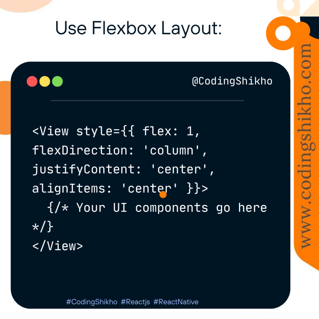
Use Flexbox Layout:
React Native uses Flexbox for layout, which is a powerful and responsive layout system. Utilize Flex, FlexDirection, JustifyContent, and AlignItems properties to create flexible and responsive designs.
Responsive Images:
Use the Image component’s resizeMode property to control how images should be resized within their container.

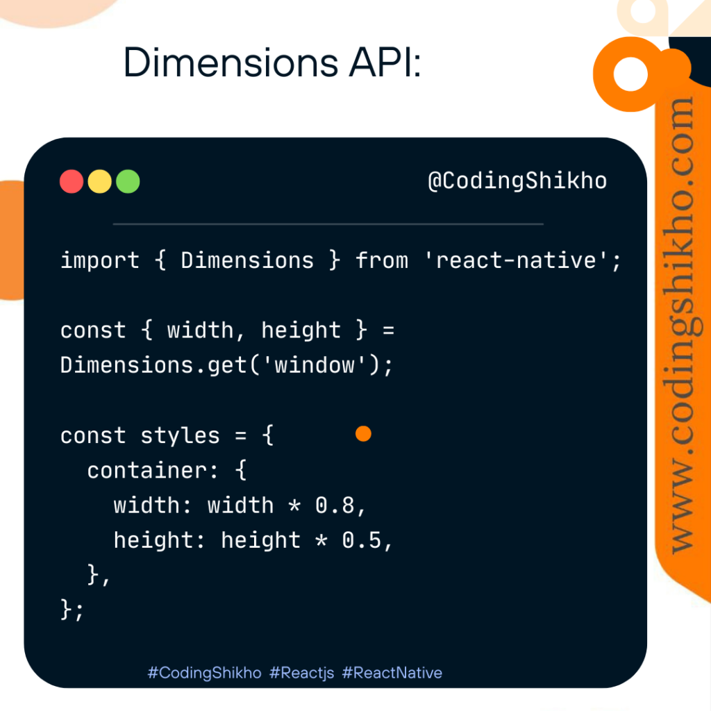
Dimensions API:
Access the device’s screen dimensions using the Dimensions API and adjust styles accordingly.
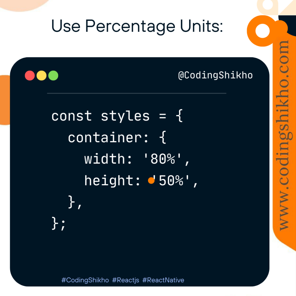
Use Percentage Units:
Instead of fixed pixel values, use percentages for width and height to make your components adapt to various screen sizes.
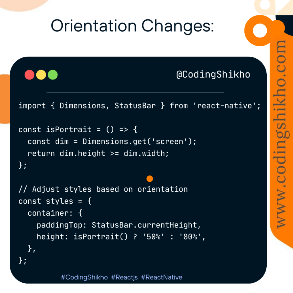
Orientation Changes:
Adjust your UI based on the device orientation. Listen to orientation changes and update your styles accordingly.
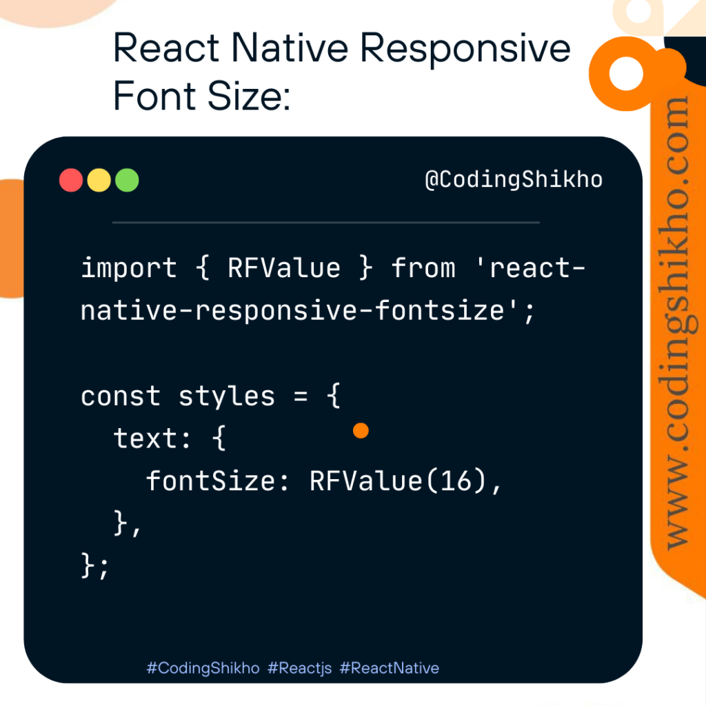
React Native Responsive Font Size:
Use libraries like react-native-responsive-fontsize to scale font sizes based on the device’s screen size.
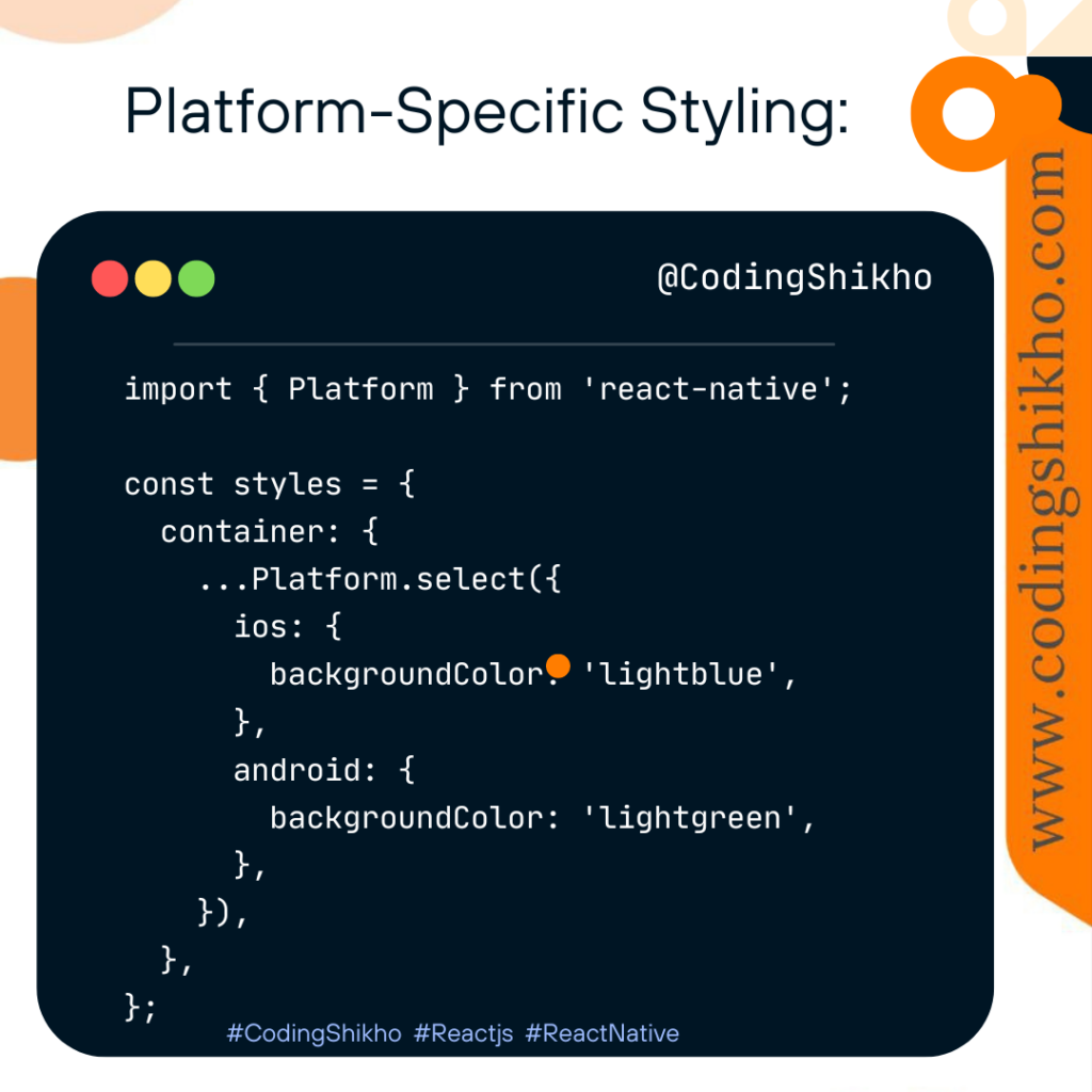
Platform-Specific Styling:
Adjust styles based on the platform using the Platform module.
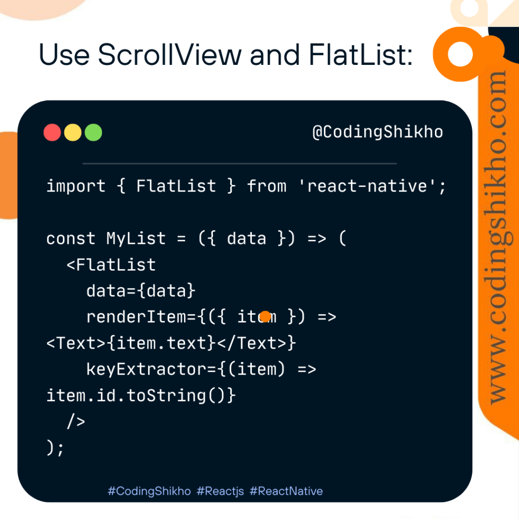
Use ScrollView and FlatList:
When dealing with lists or long content, use ScrollView or FlatList components to make the UI scrollable.
you can create a responsive UI in React Native that looks good on a variety of devices with different screen sizes and orientations. Testing your app on various devices and simulators is essential to ensure responsiveness across different scenarios.